Project Fly
Explore your third side
What it takes to design or build something which connects emotionally, which people would like to use and keep on their phone. Project Fly is on similar lines where it tries to connect with users emotionally, and it tries to uncover the user's other side.
My role
I decided not only to lead but also design Project Fly because travel is one of my favourite domain, and as a traveller, I connect to this domain very well.
On this project, I collaborated with one other designer, market researcher and 1 Product manager and a Business analyst.
Responsibilities
- Stakeholder management
- Planning and estimation
- Prepare a research and delivery plan
- Arrange resources for research
- Drive market and user research
- Drive ideation workshops and design showcases
- Design delivery
- Manage design scope
- Monitor design delivery
Design team size
3 Designers
Tools
Pen & Paper, Google Forms, Figma
Duration
3 months
What's Project Fly?
A travel startup that wants to go beyond just flight or hotel bookings. Fly wanted users to come to the app not only when they want to travel but in their free time. Fly aims to provide a motivation-based immersive experience and gain a significant competitive advantage in the travel domain.
Fly believes that by taking account of motivation-based thinking to tailor offers to meet user's complex needs, the industry can foster longer loyalty amongst explorers and more effective conversion for Fly.
Who will use Fly?
People who are interested in adventure travel and wants a seamless booking experience.
The problem
The travel industry has tended towards fragmentation. Operating in silos may serve the sector, but it’s not an approach that always best helps the customer, especially when trends indicate that users are increasingly searching for a ‘rounder’, more connected and seamless experience. For the travel industry, this means supporting travellers at all stages of their journey, from dreaming to arrival at their destination.
Traditionally, the travel industry has centred on more linear segmentations such as socio-economic and geographic criteria, or solely on destination-driven or date range hunt, and that’s what Fly wants to break for adventure travellers.

Help people who have a passion for adventure activities."
Value Fly want to provide
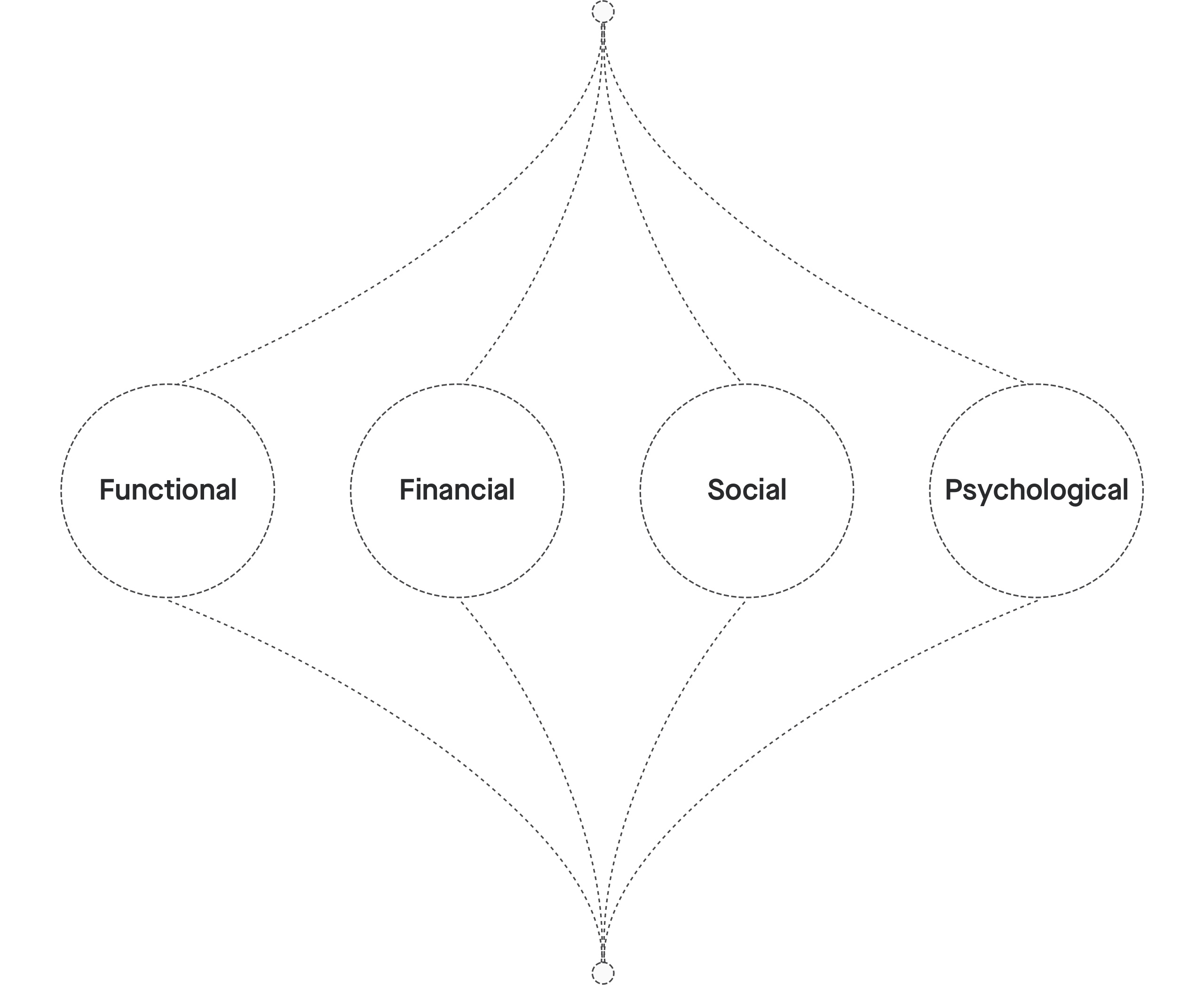
Before I start, I wanted to know what values Fly will provide to the user. Because travel is a crowded market, and it was essential for me to know where Fly will fit in this crowded market and its product value. Product manager and I had a workshop with stakeholders where we defined the values which are recommended by Peter Doyle's "Value-Based Marketing" four concepts of value.
Functional value
What this product is going to do? What problem will it solve?
It'll help users to build the list of activities which they wish to do in their life. The product will show the top 5 places to do that activity. Place recommendations are going to be based on international accreditation/ safety/best-rated places, flight, and stay cost. Also, one-click booking of the entire activity experience.
Financial value
Is the product provided at a reasonable price?
It's going to be free to use. It'll provide financial value while making a booking. Like the system is going to suggest the best time for the activity based on the flight, stay, etc. It's a smart system that will help users in decision making without leaving the product.
Social value
Does the product enable users to connect with others?
This product will enable users to connect with others. It will improve the status of the user in other people's eyes once they do the activity.
Psychological value
Does the product enable the user to feel about themselves?
This product enables the user to feel about themselves. It brings them pride, pleasure, happiness, fulfilled.
Chapter 1 / Research
Market - Competion - User - Motivations
Competition and market research
As Fly's approach is activity-based travel, it was vital for me to know who are their competitors and where the travel industry is when it comes to activity-based travel.
As travel is already quite a mature market and there have been tons of researches, so I took a lean-approach. I dived into market and user studies from multiple sources Like 'Global report on adventure tourism' from the World Tourism Organisation (UNWTO), ThinkwithGoogle, to name a few.
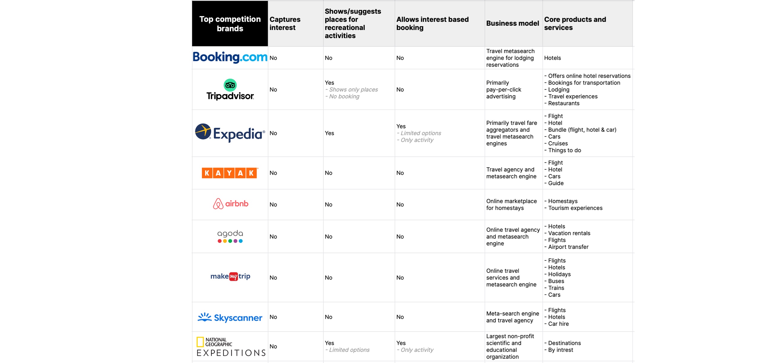
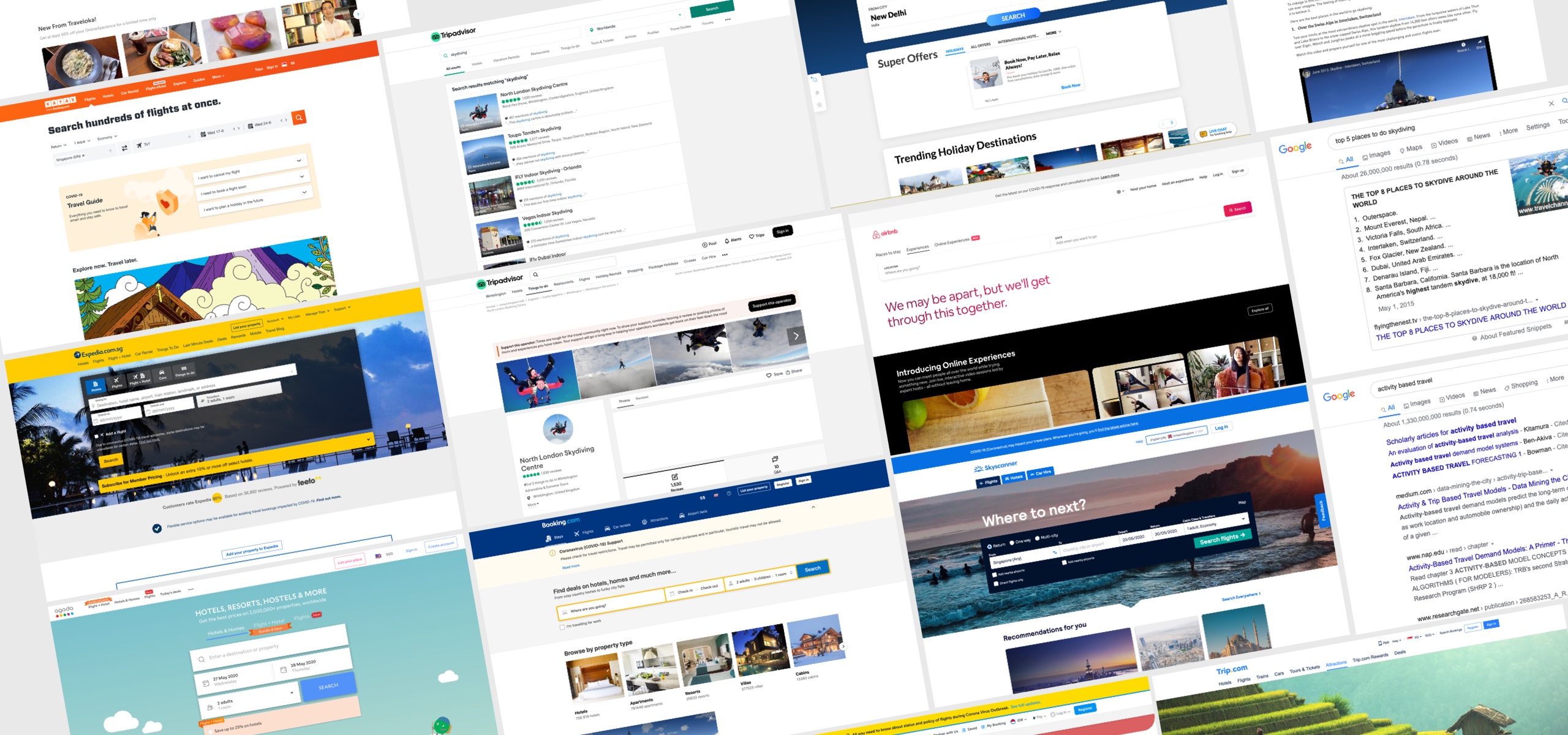
Studied top 10 travel OTA's worldwide and realised that in all "Silos are visible to the traveller, none of the platforms covered the entire ecosystem for adventure travellers."
Makemytrip had a blog about where to do skydiving but didn't cover how to book etc., which was quite surprising.
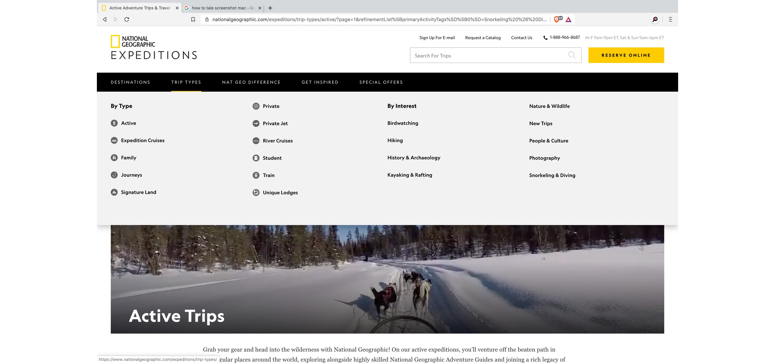
National Geographic had a few activities which users can book, but it doesn't provide flight & hotel booking, information like safety, how to reach, etc. It fails to connect all the dots for a traveller.
"Due to its fragmented nature, the travel industry is often overly focused on selling products, rather than complete, connected experiences that meet traveller aspirations."
According to 'Global report on adventure tourism' from the World Tourism Organisation (UNWTO) there are two triggers for humans, especially for activity-based tourism
1. Social driven, and 2. Self-driven. In both, the scenarios user are likely to do google (search) first where they would like to know about what's Skydiving, where to do, cost etc.
What happens if you Google 'Skydiving?
A simple google search shows lots of results but primarily from skydiving institutions or blogs from companies. When I searched "10 best places to do skydiving" It showed lots of blogs and articles and few were allowed to make bookings but again 'Silos are visible'.
Research findings
- None of the popular OTA's connects all dots for adventure travellers.
- Few operators/products show activities in their blog sections.
- Adventure tourism and activity travel market is estimated to grow at a CAGR(Compound annual growth rate) of 17.4% from 2017 to 2023.
- In India, demand for activities and local experiences has grown by 178% over the past 3 years.
- There has been noted a 42% increase in the popularity of high altitude regions among adventure travellers over the past 3 years.
- The number of solo travellers has increased by 18%.
- Adventure travellers focus a lot on safety.
- With rising levels of disposable income, many emerging economies have shown fast growth over recent years, especially in markets in Asia, Central and Eastern Europe, the Middle East, and Africa.
- Traditionally, the travel industry has centred on more linear segmentations such as socio-economic and geographic criteria, or solely on destination-driven or date range hunt.
- The ‘destination economy’ is increasingly important to travellers as they seek out new places to visit, experiences to enjoy and ways to have a fulfilling trip.
- 17% of people surveyed say they were inspired to book a trip simply because they regularly think about trips they want to take.
- The average traveller spends 13% of their time online conducting travel-related activities.
- 47% of people surveyed say they didn’t make a booking online when they intended to because it didn’t meet their needs.
- 95% of people surveyed keep visiting travel-related sites after booking.
- 74% of people surveyed re-research a trip after completing a booking.
Attracts high-value customers: Adventure tourists are willing to pay a premium for exciting and authentic experiences. Adventure operators have reported an average of USD 3,000 spent person, with an average trip length of eight days.2 Trip costs vary based on length, luxury and activity levels, destinations, and distance from a traveller’s starting point to the trip destination.
Today, Adventure Tourism is a vibrant, dynamic, and fast-changing sector with new variants routinely added into the possible experiences. Individual companies are often small, owner-operated businesses led by entrepreneurs with a drive to share their favourite entrepreneurs in rural areas around the world to do the same. 69% of overall international travel departures leave from Europe, North America, and South America, and together these three regions account for over USD 263 billion in adventure travel expenditures.
- In 2012, global tourism arrivals passed the one billion mark as one of the fastest-growing segments, adventure tourism market sizing study was conducted by the Adventure Travel Trade Association (ATTA), The George Washington University (GWU) and Xola Consulting.
- It found that the global value of adventure tourism was USD 89 billion. The study was repeated in 2013 and found that 42% of travellers departed on adventure trips, making the sector worth USD 263 billion an increase of 195% in two years.
The reasons people engage in adventure travel are diverse, but the most often cited motivations are relaxation, exploring cultures.
Sources: World Tourism Organisation (UNWTO), Adventure Travel Trade Association (ATTA), Thrillophilia, Think with Google and many more.

"The challenge is for the adventure tourism sector is to use it's best efforts to connect all the missing dots for travellers."
- Fly founder
User research - Identify the tribe and survey
Adventure travellers behaviours are different compare to leisure or business travellers. To identify the right audience, I got access to the group of users from Fly, and I also reach out to my own traveller friends who have done activities and groups which were suggested by them.
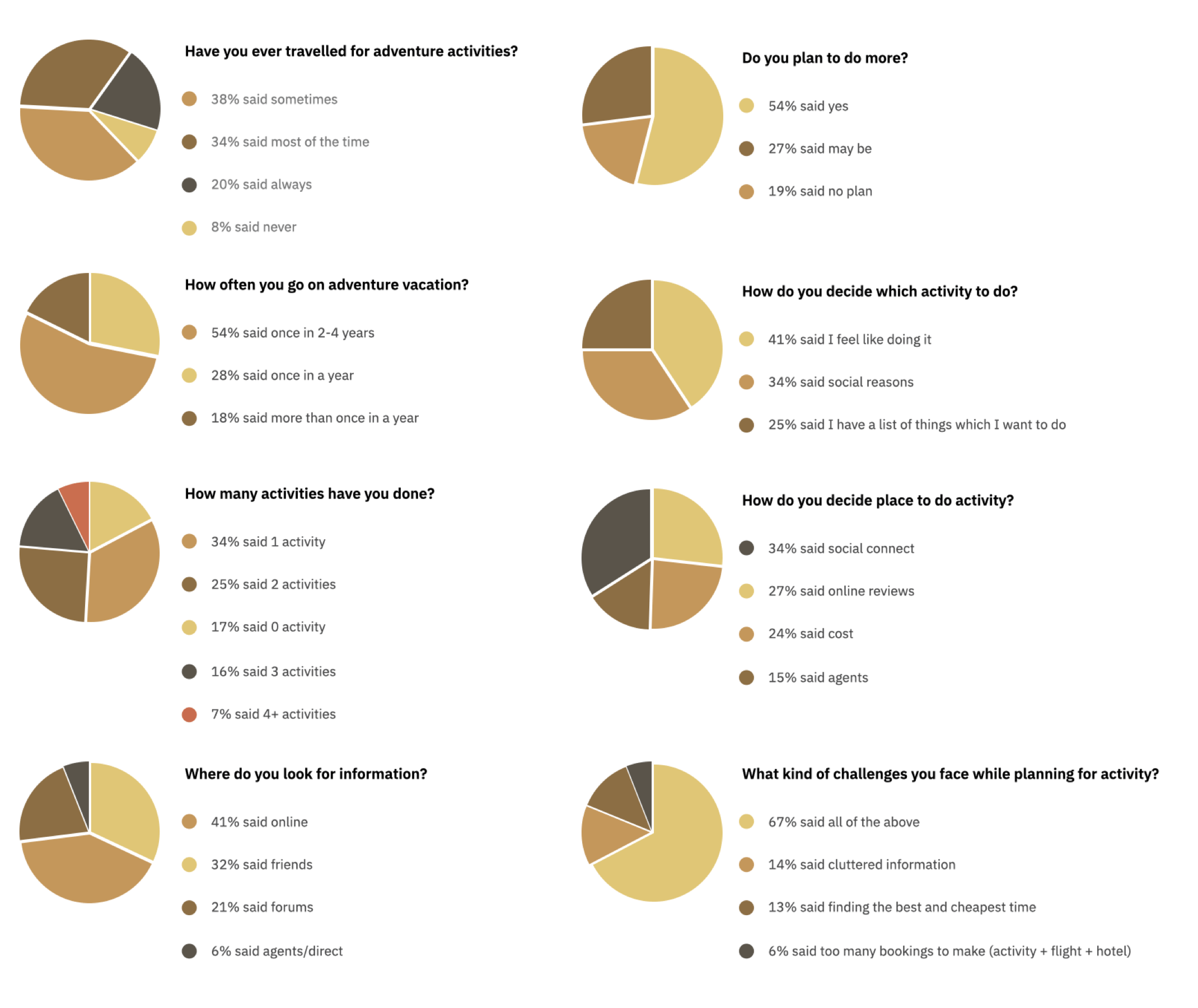
I rolled out the survey to around 566 users (Fly + friends & groups) on "Survey Monkey", and I've had shared with the community that I'm involved before. The purpose was to find the pain points of the users when they plan for activity-based travel. I wanted to see the problems that they are facing. Understanding the issues and pain points faced by users is really important to determine the direction of the project.
297 people responded to the survey, and 19 people showed interest in user interviews.
Understanding motivations - User interviews
I prepared the interview protocol and interviewed 16 users. Interviews were either at their home/office/Zoom so that they are comfortable and have complete secrecy.
Interviews were divided into two sections. First, was a question and the second section was how do they plan today?
I wanted to dive deep into why people do activities what's the trigger. During interviews and in the survey, lots of people said social trigger is a significant factor for them to do activities and they like to put on the social platforms, but for other the trigger was inner. It was more of personal motivation and satisfaction.
Interestingly during interviews, I came to know that lots of users had a list of activities which they wish to do in their life. Some had in their mind, and some had noted down in a personal diary/notes app.
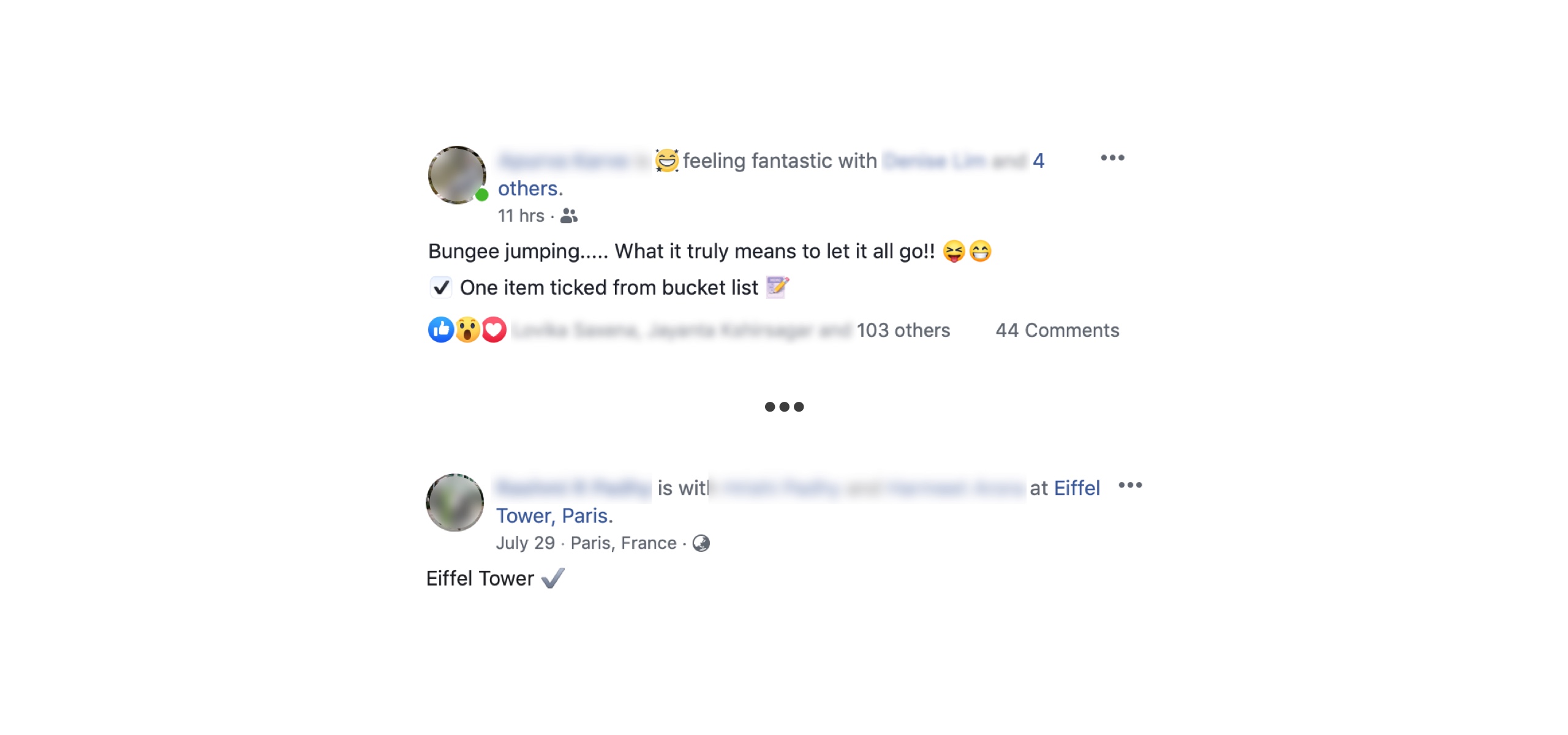
I started to recall all the social media post which people put about the 'done ✓'.
 Light bulb moment - The personal list changed the direction for me. I took a pause and started doing a study about inner motivations and social triggers.
Understand ✓ psychology
I'm a bookworm, and one of my favourite subjects is psychology. I always believed that a sense of beauty and inspiration is not enough to create a proficient design. Donald A. Norman, in his book "The Design of Everyday Things," defines design as an act of communication, which means having a deep understanding of the person with whom the designer is communicating. To get a better insight into the user's needs, I need to bear in mind the psychological principles of human behaviour, aspirations, and motivations.
During interviews, I focused a lot on why people go to activities, and I observed that people travel for different reasons. Overall I saw three trends:
- Few people travel to relax, to take a break from life.
- Some because of social FOMO. I remember one couple said their group of friends have done skydiving and scuba diving, so they also want to do it because they don't want to feel left out.
- Some travel for self-accomplishment. These type of users are more into doing something which can an activity, cultural trip or maybe hiking.
9 users mentioned that deep down they want to do things and in their free time they explore those activities which they wish to do.
I started reading a lot about human psychology to understand the 'deep down, and this knowledge helped me to create the experience which will make users perform the actions they are expected.
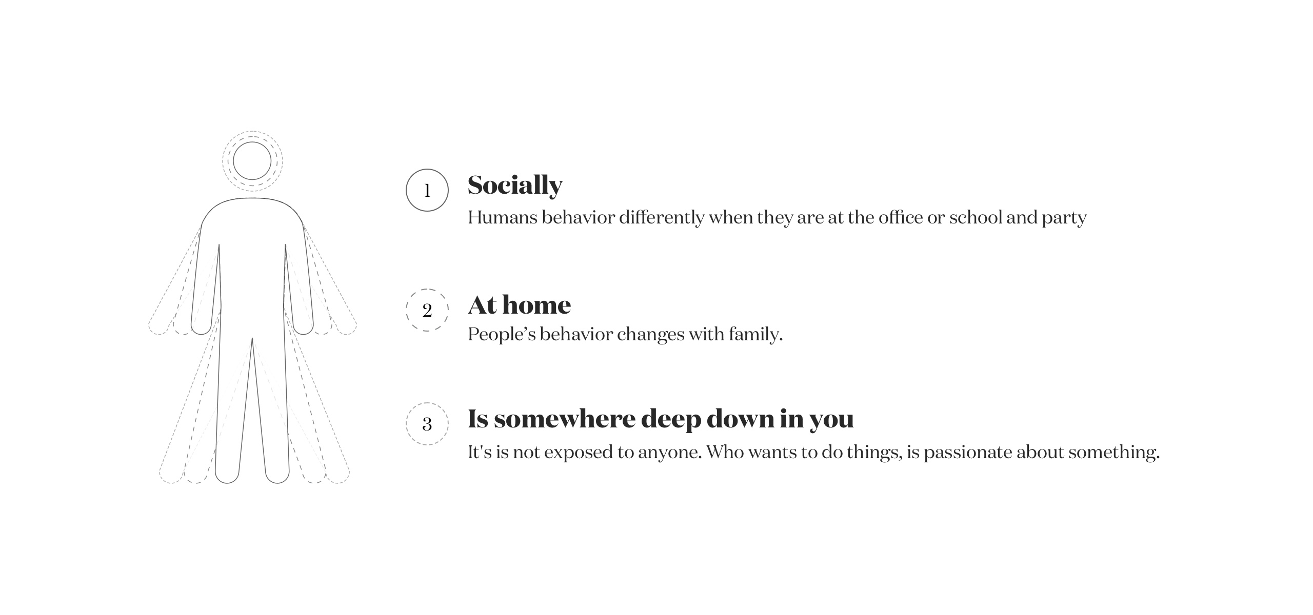
One of the psychology studies reveals about Human Behaviour that there are three personality types — social, reserved (at home), and self-centred (deep down) — and these findings might change the thinking about personality in general.
It was a step forward for me.
"Every human has 3 characters."
Activity Motivation based travel - Make your dream list
Travel is full of emotions, and emotions are situational. It's essential to know the pulse of the users and what they wish to do which activity and when they explore activities which they want to do.
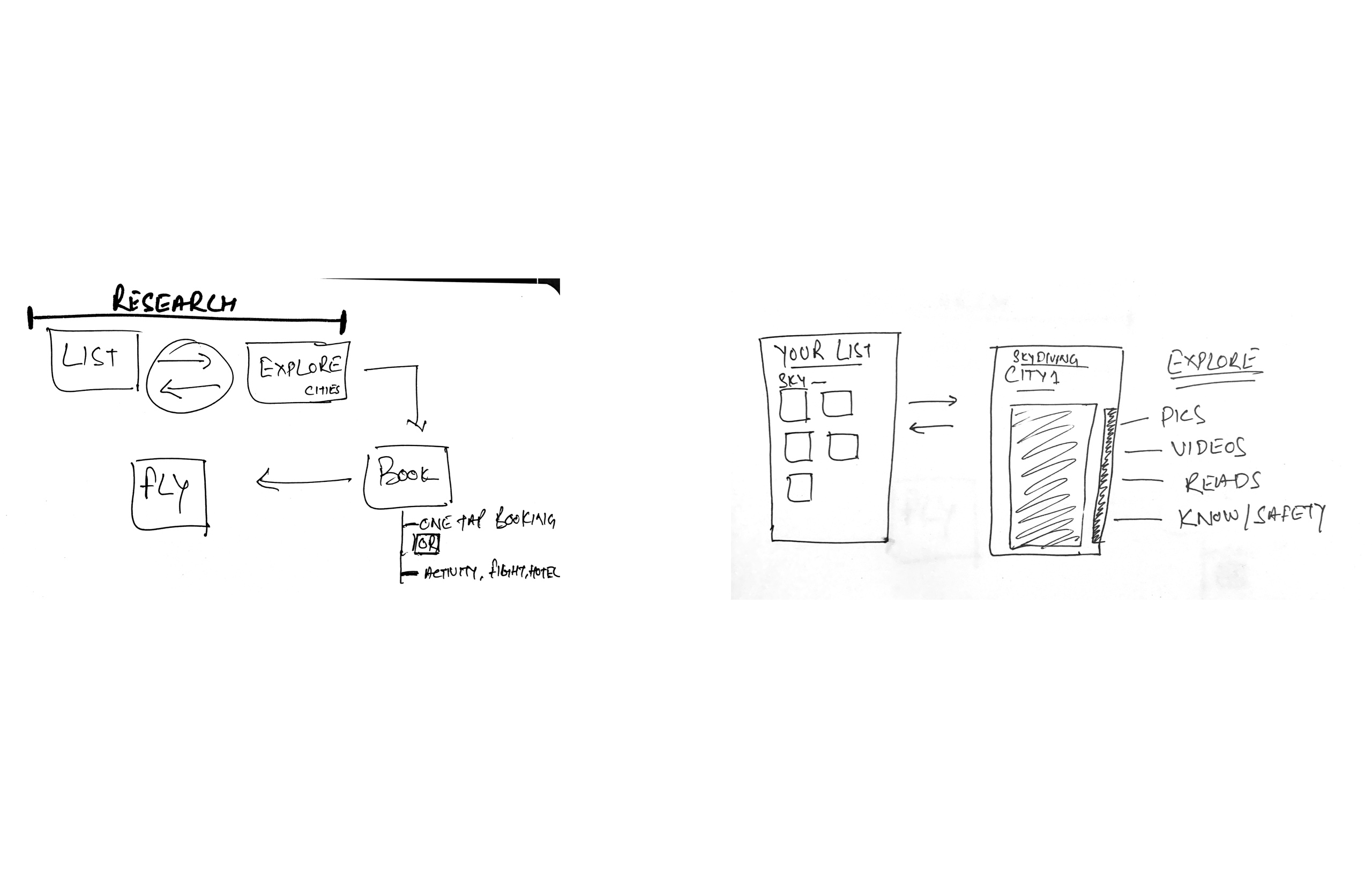
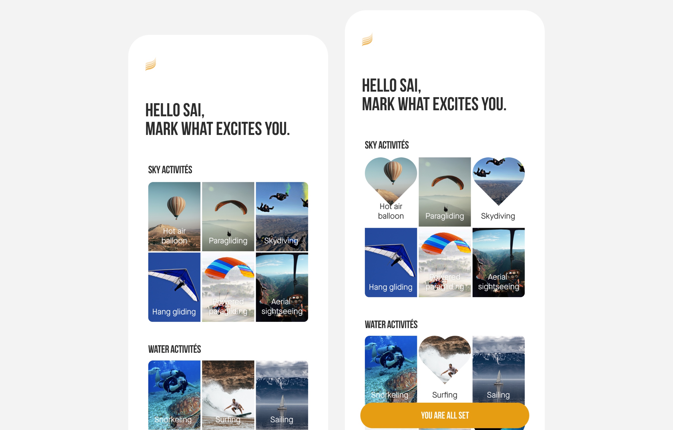
During user interviews, nine users showed me their travel list. A list was full of activities and places which they wish to visit or do. That gave me an idea that it's a good idea if users can maintain their list of activities in Fly we show recommendations based on that.
I tested creating and maintaining a list (quick sketches) concept will all nine users, and everyone loved that idea. What everyone liked was that now the places are going to be more relevant and it'll be easy for them to know how much their dream is going to cost.
One pattern which came out from this study was that 'making a list gives users a substantial reason to come back' to Fly app and explore, which will help in increasing Fly adoption.
Capture the story - Current flow of finding information
During the user research, one of the goals was to understand users today's journey. How do they plan, what all places they go to find information.
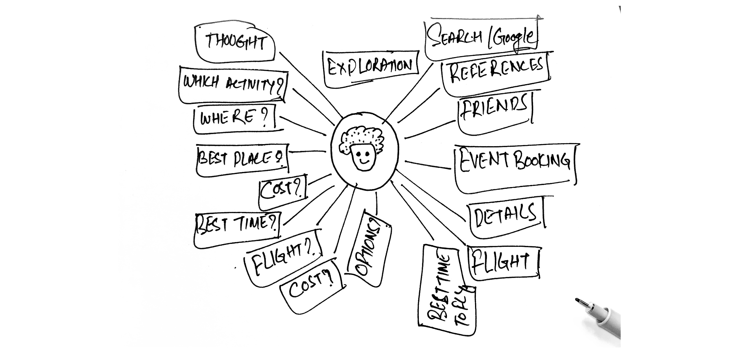
To understand in-depth, I asked users(few were solo, few were with partners) to think aloud while they find the following details.
- Choose one activity which they would like to do? e.g., Skydiving
- Find the places where they can do Skydiving.
- Find the top 5 places to do that activity?
- What motivates them to decide on a place?
- Trust?
- Accreditation?
- Cost?
- Friends/Social?
- Find the best flight and accommodation
- Find the best time to do an activity
- Find the cheapest time to fly
- Find out the total cost.
During this exercise, I saw that there was a lot of palavers involved. To choose one place, they have to go to multiple websites to find out activity details, flight and stay cost. Users couldn't find out the best time to fly.
The current flow of finding information is a non-linear and non-sequential journey.
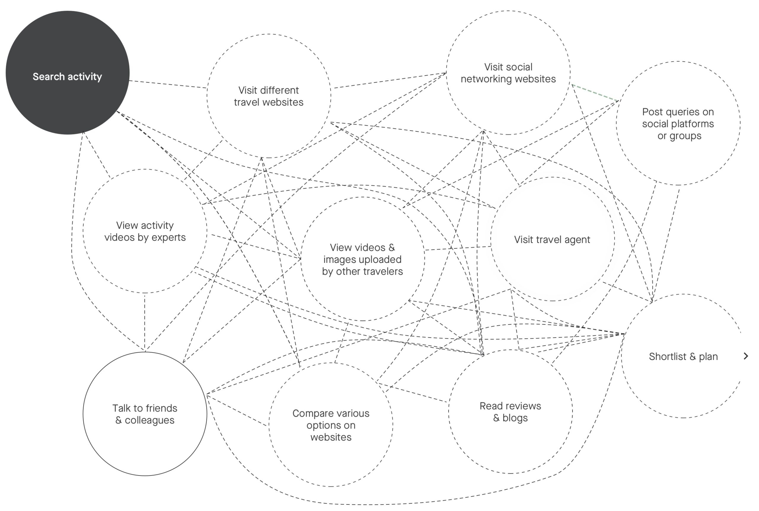
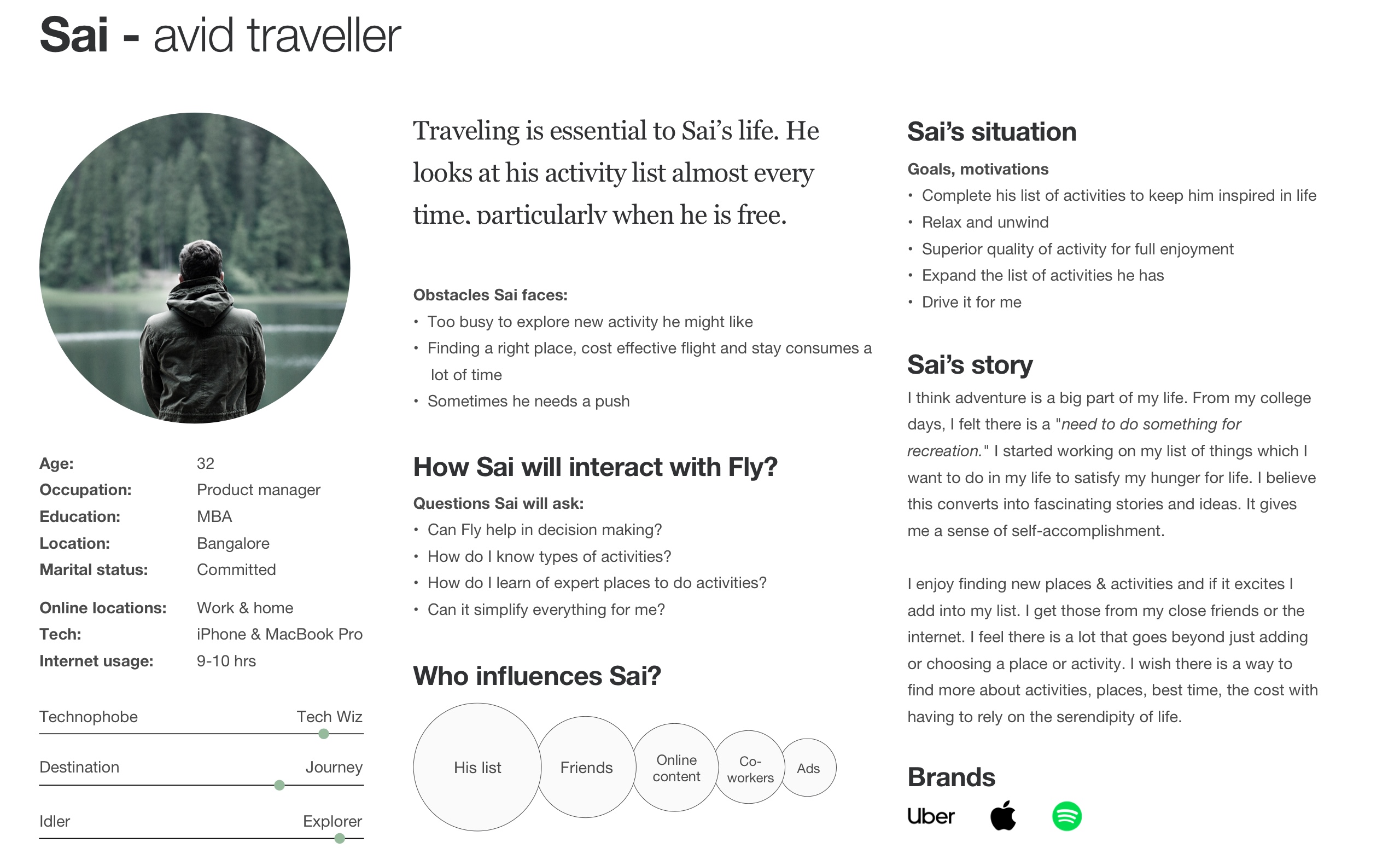
Adventure tourists typically go through Six stages
Sources: ATTA (2013)
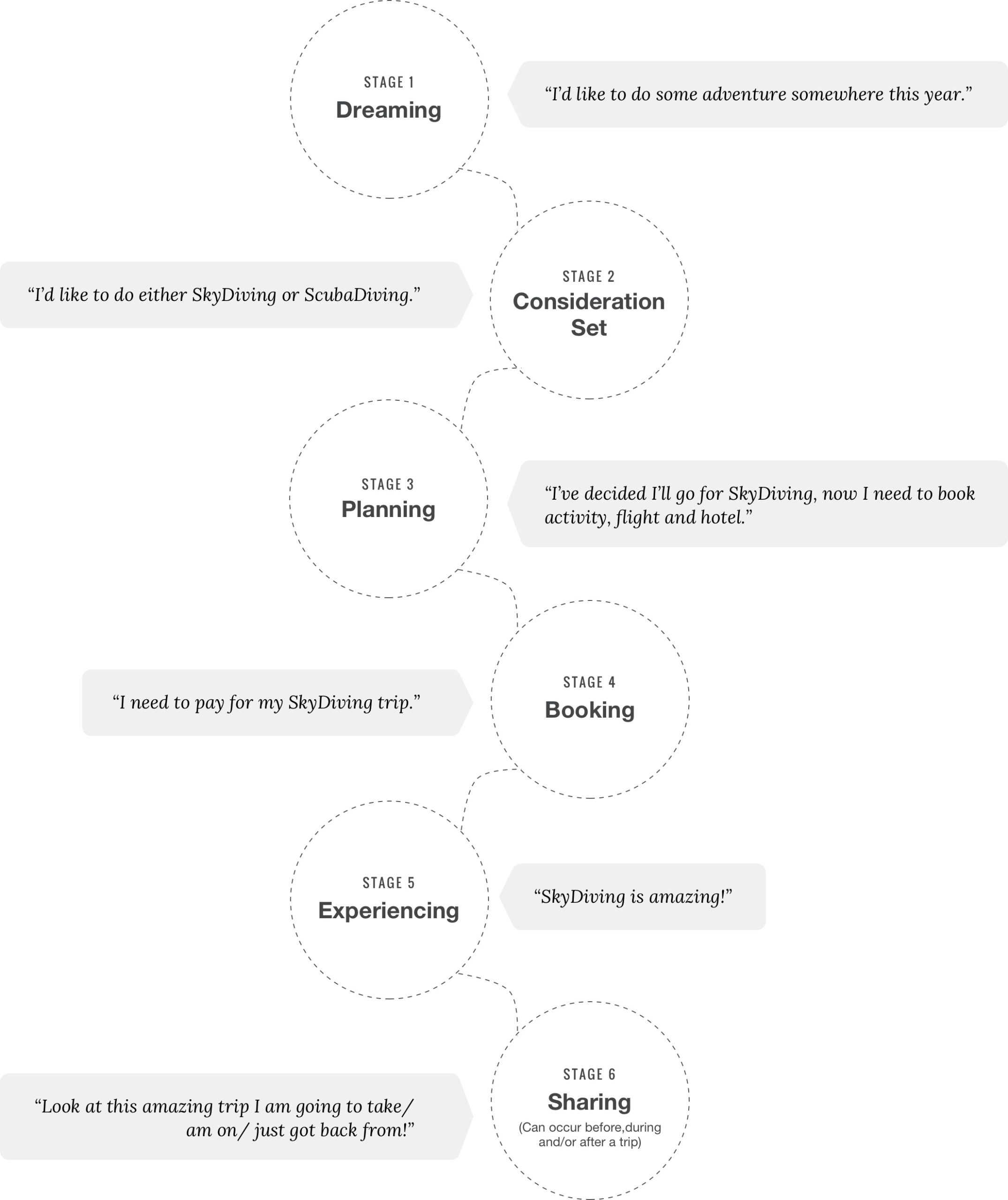
Experience Mapping
With my user research conclusion, I created a user persona. While working on their user journey, key frustrations and designs, I noticed that there were several crosses over in their pain points despite that being different individuals. Hence, I created the following user experience map that applies to our pool of users who shared a common goal of using Fly to use for motivation based travel.
User goal: plan and book activity, flight and hotel.
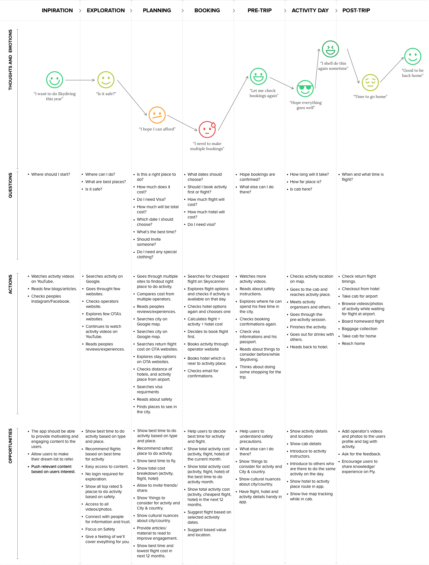
Persona
Based on the interviews insights, I designed a persona that represents the amplitude and characteristics that I found in the users. To illustrate the deepness that I got, I show one of them below: Sai represents a group of users who have a list and a traveller.
Research Conclusion
Key user frustrations
- No single source for inspiration.
- Multiple sources of information lead to confusion.
- Accreditation and safety information is missing in most of the places.
- First book activity or flight is a challenge for users.
- What's the best time to do the activity as most of the events are nature-based?
- Too steps in planning increase the cognitive load on users.
- Too many bookings to make.
- None of OTA's provides a seamless activity-travel experience.
- On average, 12-15 website users go through to find information about the activity, places, safety, flight, hotel, visa, videos and images, reviews and social connect.
- Every website shows a different list of places for activity.
Solution Approach
Build an experience that is user-centric and caters to the user's needs and wants.
Define content and visual hierarchy to help users to understand the information they need and learn how to use the app in a faster.
Inspire users to come back to the app to increase product adoption.
Enable users to accomplish pride, pleasure, happiness, fulfilled.
Help users in decision making for all main stages (inspire, explore, decide and book).
Help users achieve the results with the appropriate data set and minimal inputs.
Show Top 5 activity places based on location, safety and price.
Guides user post-booking for things like Visa, law and rules for foreigners in the destination city/country.

Adventure travelers are early adopters by nature, meaning they are generally more willing to try new destinations, activities, and travel products."
World Tourism Organisation (UNWTO)
Chapter 2 / Solution
Flows - Designs - Testing
Simplified stages and flow
During the current finding information flow and stages observations, I heard a few words quite often while users were trying to play with the current flow.
- "Let's explore more."
- "I'm confused."
- "Let's lock (decide) this place."
- "Shell we book this?"
- "Let's books this?"
I realised how much cognitive load users were dealing with while trying to find out what to do, where to go when to go, how to go, best time, which flight and hotel, etc.
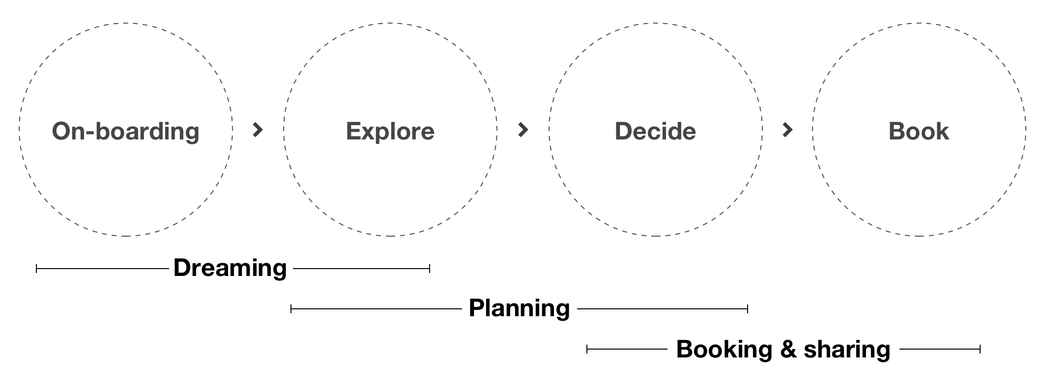
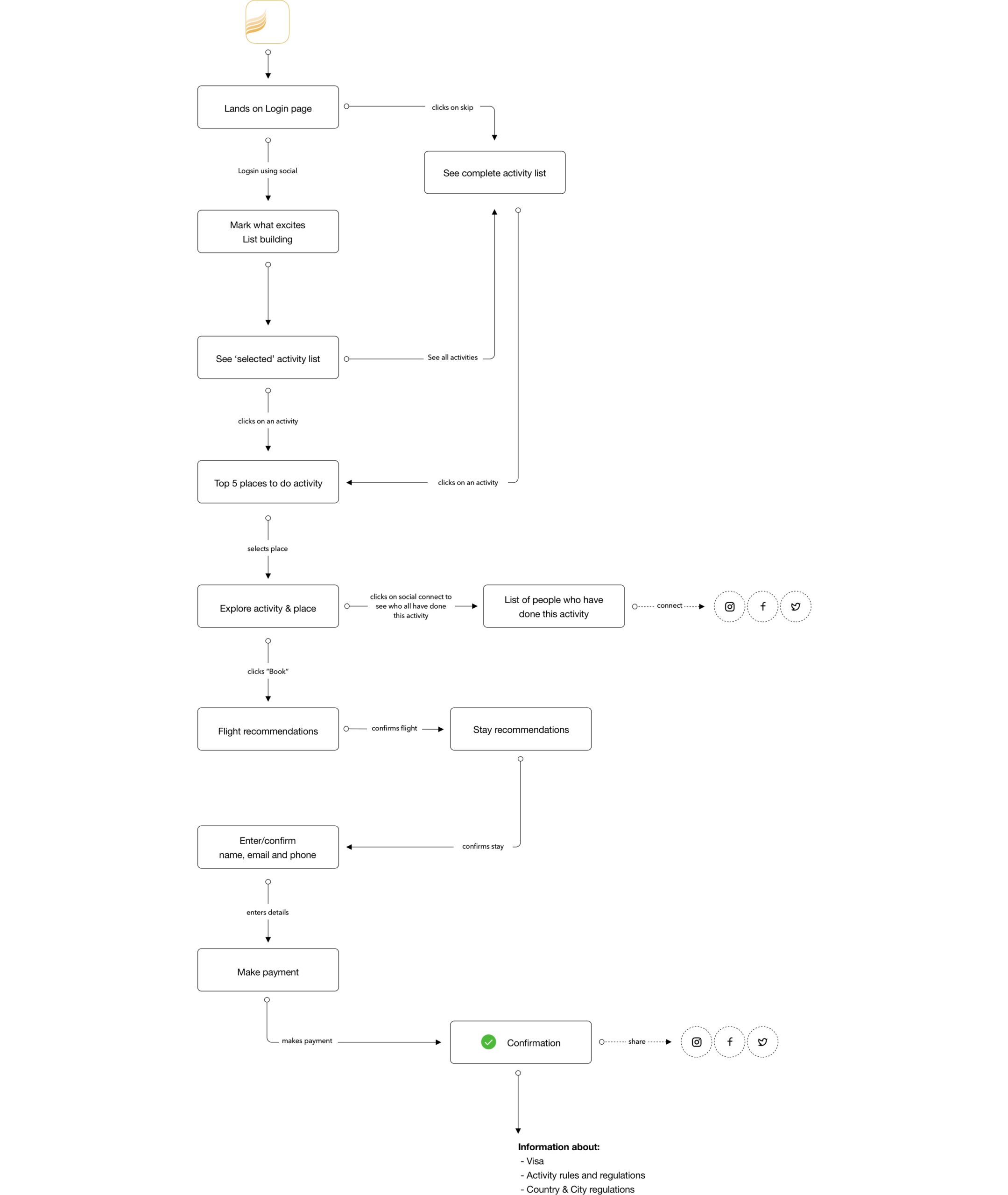
Users statements gave me the direction to come up with the new simplified flow, flow with reduced stages (explore, decide, book) and which will focus more on lowering memory load and will help users in decision making.
Design goal
I aimed for a solution in which people would connect with users emotionally. Something which will bring users back to Fly and they feel happy and engaged when they use it.
At the interaction level, the focus was to help users in decision-making. I focused on minimal gesture-based interaction and showed all the necessary information in the first view.
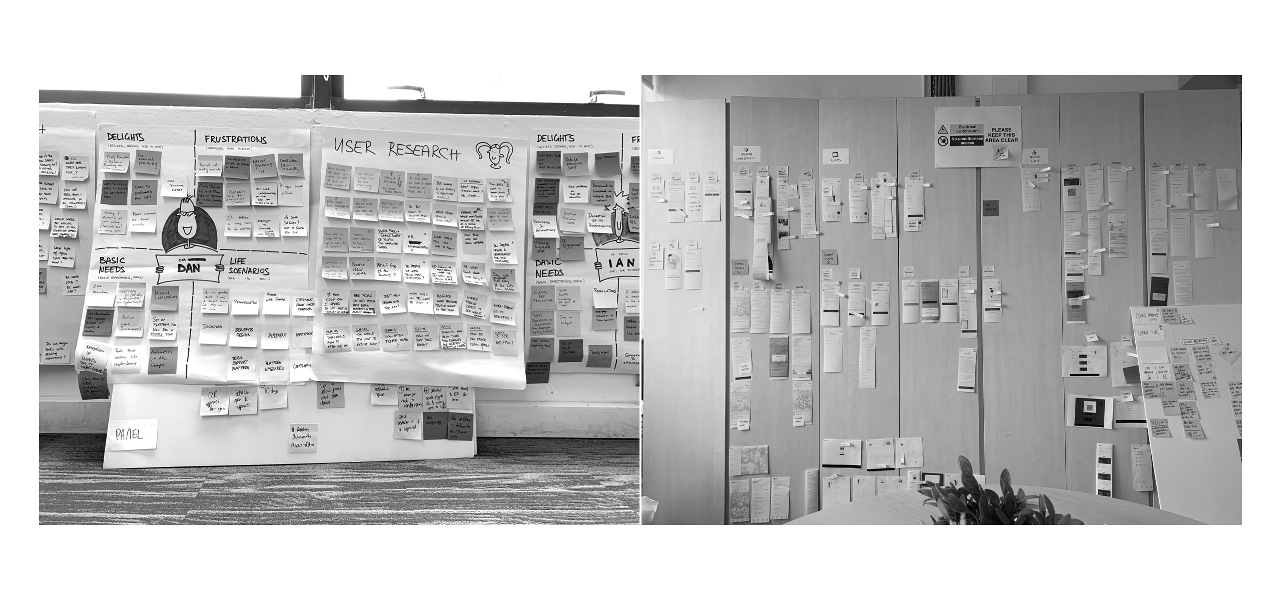
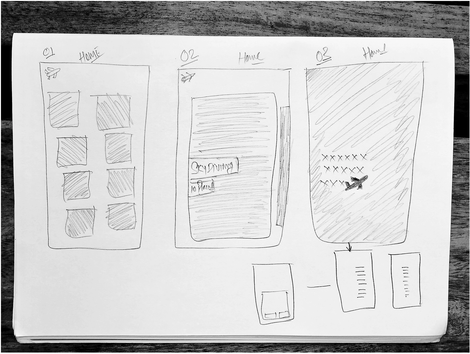
I started exploring various layout and navigation options. After lots of iterations and discussions with users, I closed on the designs which had a lesser learning curve. While showing designs, I used to hand over the phone with interactive prototypes to people and ask them to use it. The main focus while observing them used to be on predictability and learnability.
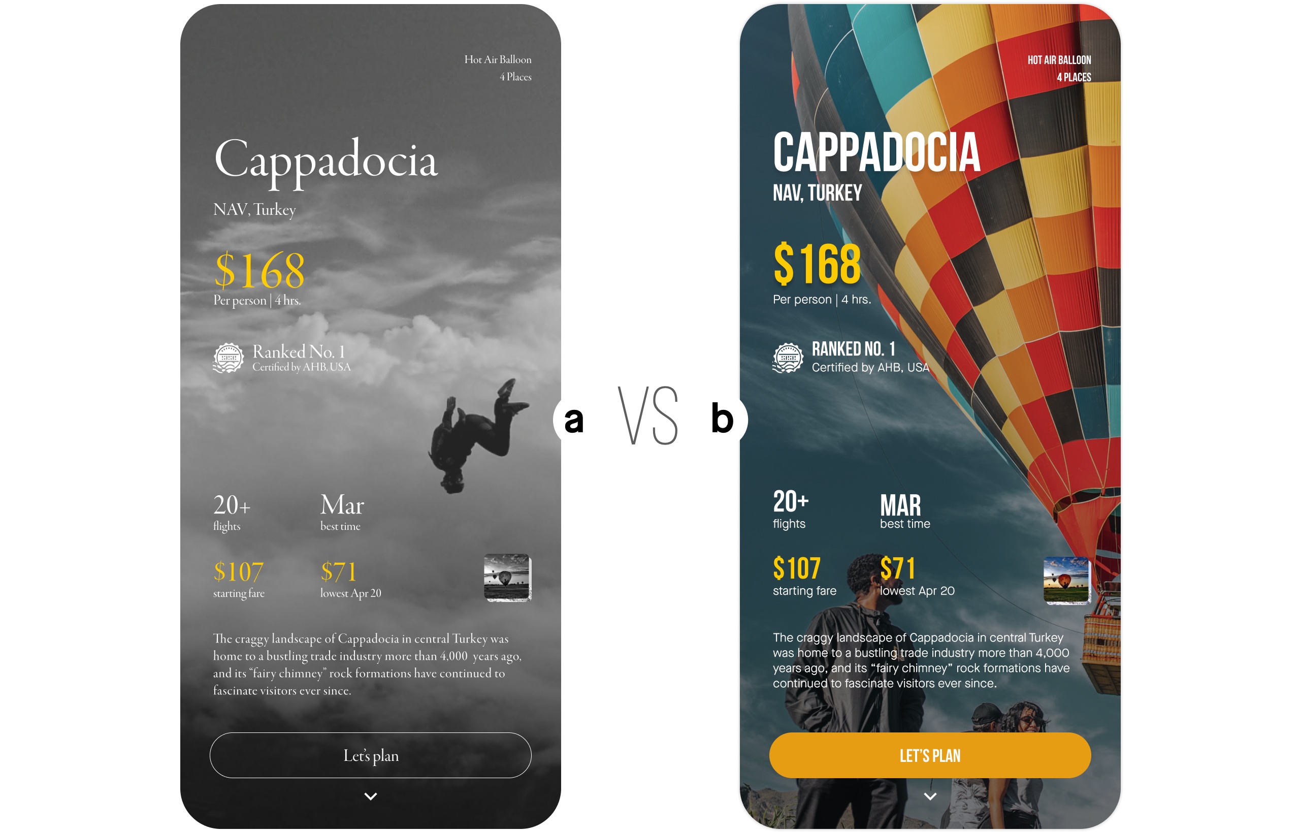
Design direction (A vs B)
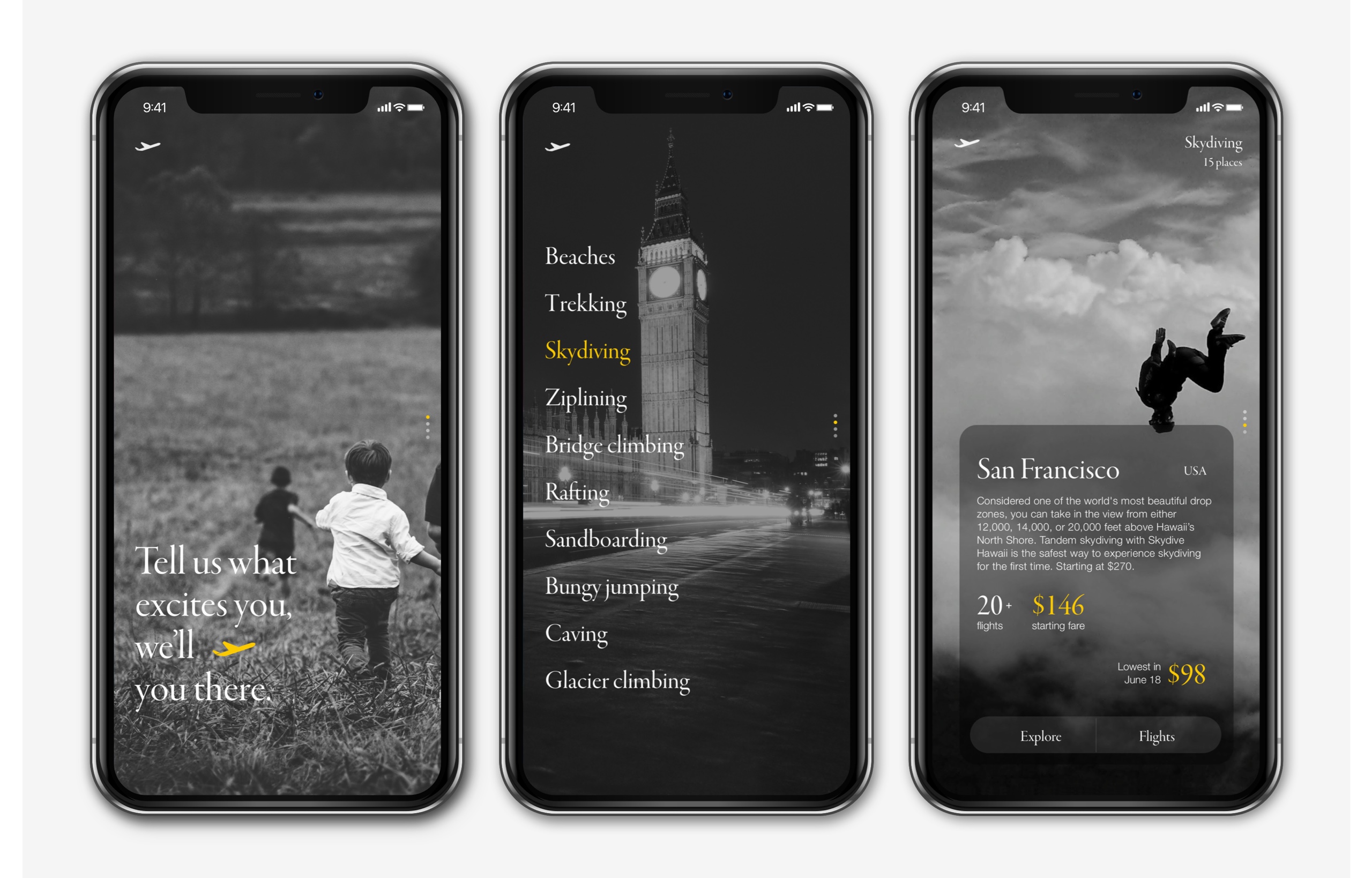
For visuals to start with I created two visual directions. One was colourful with lots of images as it was supposed to look full of liveliness, bright and happy. The second was the opposite, It was classy black & white with sans serif fonts, but both were identical functionally. I must say black, white, and serif fonts make me happy.
Test what connects to users.
I tested both designs with 9 users mix of the mid-'20s and '30s. I divided the test into 2 stages to get more insights.
Stage 1 - 5-second test: I did a 5-second test to get the first feel of designs what people think at the first view without going into details. The idea was to capture first level thoughts, feelings, emotions which they go through when they see it for the first time.
Stage 2 - Full detailed comparative test: In this, they explore all core tasks.
During testing, all 6 users liked black & white designs, but somewhere they associated with a reading app, and some of the users said it looks sad, lacks appeal, it doesn't persuade them to continue. One of the users said it feels depressing and sad.
After testing with 9 users, I noticed how important colours are and how it builds perception.
"Colours bring joy."
Playful gestures
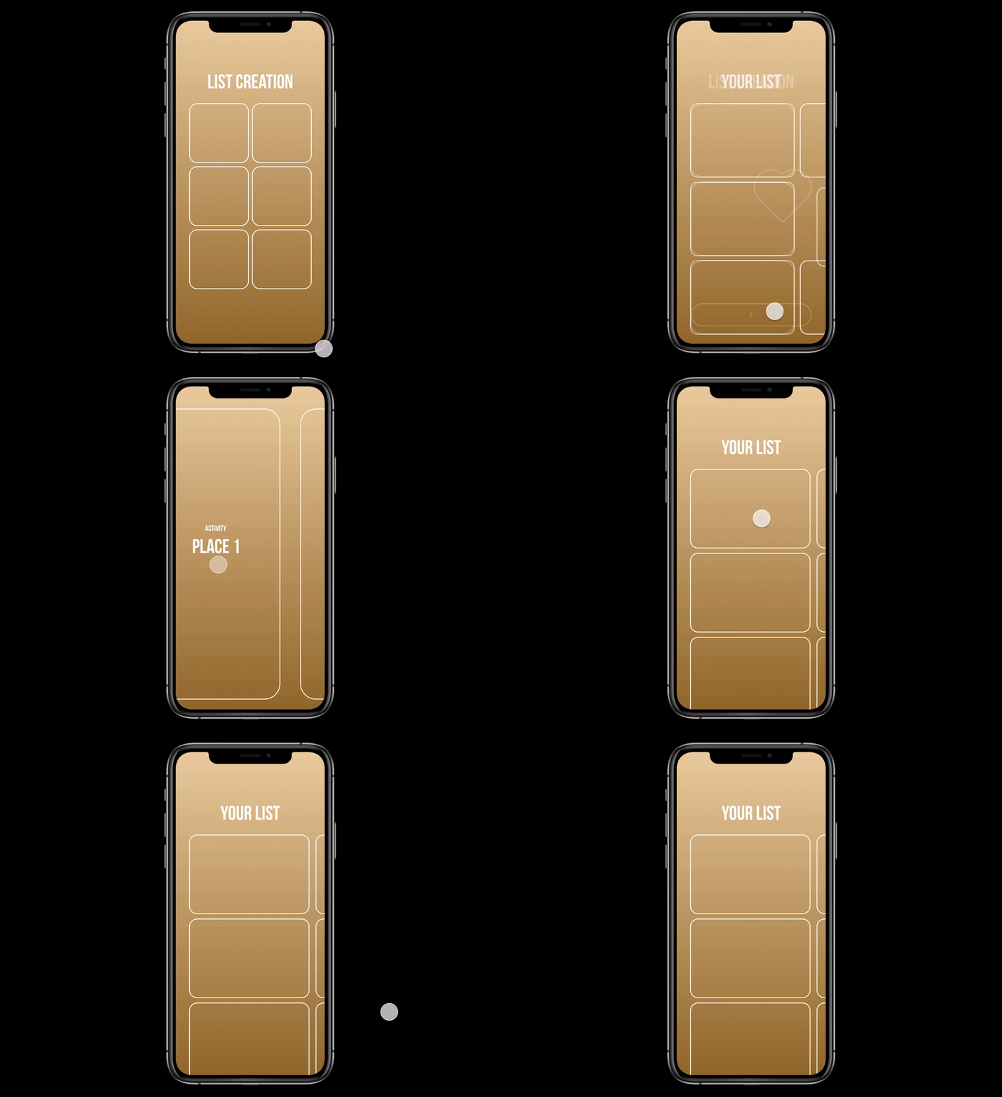
The idea was to let users reach information with minimal inputs (Minimal input > Maximum output). Planned interaction with max 1-2 swipes and 1-2 taps. Less stressful, playful and engaging.
Designs
Testing
Users have to complete 3 tasks. Some tasks were specific instructions, while some were more conversational and feedback based.

Test 1
After testing 5 users, I noticed a trend of the consistent fail rate at one tap booking. I decided to pause the tests and make iterations before I proceed for another round of testing.
- Usability tests: 5 users
- The average time took: 12.7 mins
- Successful rate: 59.7%
Test 2
I did another round of testing with new users and saw a significant improvement in results:
- Usability tests: 6 users
- The average time took: 8.1 mins
- Successful rate: 87.9%
Issues discovered
- One tap booking options (8%)
The estimated cost is shown for 2 two possibilities. Current months best cost and the best time to fly in next 1 year. Users missed the second option. I did design tweak to deal with that issue. I introduced a horizontal scroll. - Date change for flight (4%)
The date is driven by activity date. And few users tried to change that on the flight date. Hence I changed that and allowed users to change flight date (departure). - Button label change (27%)
On the activity page, the first button was labelled as book and users were afraid to click on that because they felt it might book the trip. It was simple English change, but it showed that how people perceive. I changed that to 'Let's plan' which gave them a sense of control.
Iterated version
The success rate of those 3 questions increased by the following:
1) One tap booking: 8% >0%
2) Date change for flight: 4% > 0%
3) Button lable change: 27% > 0%

Travellers have individual idiosyncrasies and subtle personal motivations that need to be carefully understood."
Fly founder
